YUI 2: ProgressBar
YUI 2: ProgressBar
The YUI ProgressBar Control provides a visual means of showing progress of an ongoing operation. The ProgressBar can be enhanced via CSS styles to provide different colors, shapes and textures. The bar can move horizontally or vertically, forward or reverse. The movement can be enhanced by using the Animation utility. A textual representation of the bar can be displayed, which is also available for WAI-ARIA screen readers.
On This Page:
Quick Links:
- Examples: Explore examples of the ProgressBar Control in action.
- API Documentation: View the full API documentation for the ProgressBar Control.
- Release Notes: Detailed change log for the ProgressBar Control.
- License: The YUI Library is issued under a BSD license.
- Download: Download the ProgressBar Control as part of the full YUI Library at YUILibrary.com.
Getting Started
The ProgressBar code must be included before any control can use it:
<!-- Required CSS -->
<link type="text/css" rel="stylesheet" href="http://yui.yahooapis.com/2.9.0/build/progressbar/assets/skins/sam/progressbar.css">

<!-- Dependency source file -->
<script src = "http://yui.yahooapis.com/2.9.0/build/yahoo-dom-event/yahoo-dom.event.js" ></script>
<script src = "http://yui.yahooapis.com/2.9.0/build/element/element-min.js" ></script>
<!-- Optional dependency source file -->
<script src="http://yui.yahooapis.com/2.9.0/build/animation/animation-min.js" type="text/javascript"></script>

<!-- ProgressBar source file -->
<script src = "http://yui.yahooapis.com/2.9.0/build/progressbar/progressbar-min.js" ></script>

YUI Dependency Configurator:
Instead of copying and pasting the filepaths above, try letting the YUI dependency Configurator determine the optimal file list for your desired components; the Configurator uses YUI Loader to write out the full HTML for including the precise files you need for your implementation.
Note: If you wish to include this component via the YUI Loader, its module name is progressbar. (Click here for the full list of module names for YUI Loader.)
Where these files come from: The files included using the text above will be served from Yahoo! servers. JavaScript files are minified, meaning that comments and white space have been removed to make them more efficient to download. To use the full, commented versions or the -debug versions of YUI JavaScript files, please download the library distribution and host the files on your own server.
Order matters: As is the case generally with JavaScript and CSS, order matters; these files should be included in the order specified above. If you include files in the wrong order, errors may result.
The ProgressBar control is defined by YAHOO.widget.ProgressBar, which extends YAHOO.util.Element. Create a progress bar by instantiating ProgressBar with optional configuration attributes and then rendering into the element that will contain it:
var progressBar = new YAHOO.widget.ProgressBar();
progressBar.render("pbContainer");
You can supply initial configuration attributes and call the render method in one step:
var progressBar = new YAHOO.widget.ProgressBar({
    width: "300px"
}).render("pbContainer");
The ProgressBar defaults to a simple blue bar moving from left to right. If the "Sam" skin is used it will show a color scheme compatible with other YUI components. The direction of movement can be changed up to the moment it is rendered. It can also go from right to left or vertically from top to bottom or bottom to top. To create a ProgressBar moving from bottom to top, either of the following two snippets can be used:
var progressBar = new YAHOO.widget.ProgressBar({
    direction: "btt",
    height: "150px",
    width: "30px"
}).render("pbContainer");

// or...

var progressBar = new YAHOO.widget.ProgressBar();
progressBar.set("direction","btt");
progressBar.set("height","150px");
progressBar.set("width","30px");
progressBar.render("pbContainer");
See the examples below in Using ProgressBar or the API Documentation for more details.
Using ProgressBar
This section describes several common uses and customizations of ProgressBar and contains these sections:
- Moving the Bar
- Animating the Bar
- Setting Up your Style Definitions
- Responding to Events
- Captioning
- WAI-ARIA support
- Scaling of the mask
Moving the Bar
The length of the bar represents the value of the value configuration attribute.
It is scaled so that the initial edge of the bar (i.e., on a bar with direction set to 'ltr' it would be the left edge)
represents the value held in the minValue attribute and the end edge is set to maxValue.
The value, minValue and maxValue attributes are plain numbers in arbitrary units,
the ProgressBar scales them to and from actual pixel values.
// This would be half way progressed
var progressBar = new YAHOO.widget.ProgressBar({
    minValue: 60,
    maxValue: 90,
    value: 75,
    height: 150,
    width: 30
}).render("pbContainer");

// This would move it one third progressed
progressBar.set('value',70);

// This is out of range, it will be ignored
progressBar.set('value',100);

// value is still 70
alert(progressBar.get('value'));  // should show 70
Animating the Bar
If the Animation utility
is loaded, the ProgressBar can use it to move the bar by enabling the anim configuration attribute.
This attribute accepts either a boolean to enable/disable animation or an instance of
YAHOO.util.Anim. When read, anim will return the instance
of the Animation object created or null if there is none.
The properties of the Animation object can then be accessed directly to set the behavior of the bar,
usually with duration and the easing method. Note that any easing
affect is visual in nature only and the underlying value itself does not have any easing
applied to it. As a side affect, the bar may be rendered outside the bounds of its container
during easing. The following code makes the movement
last for 3 seconds and bounce both at the start and end of the movement.
var progressBar = new YAHOO.widget.ProgressBar({
    anim: true
}).render('pbContainer');

var anim = progressBar.get('anim');
anim.duration = 3;
anim.method = YAHOO.util.Easing.bounceBoth;
Setting Up Your Style Definitions
The ProgressBar component makes use of several CSS classes to style the bar. You can either use the "Sam" skin CSS provided by default, or you can create your own. If you create your own, you'll need to use the class names the ProgressBar assigns to its elements.
| Selector | Attribute | Description |
|---|---|---|
| .yui-pb | width height | Overall size of the ProgressBar. It can also be set via the width and height configuration settings. |
| .yui-pb | background-image background-color | Background to be used on the area the bar is not covering. |
| .yui-pb | border | Border around the component. |
| .yui-pb-bar | background-image background-color | Image or color to use for the bar itself. |
| .yui-pb-bar | margin | Offset from the edge of the ProgressBar to where the transparency of the mask starts. |
| .yui-pb .yui-pb-anim | background-image background-color | Image or color to use for the bar while it is moving. |
| .yui-pb-mask div | background-image | Mask with transparencies to allow the bar to show through. |
| .yui-pb-caption | font and others | This style is not actually used by the ProgressBar, but is is defined in the "Sam" skin to be used to display the value of the bar. |
| .yui-pb-range | font and others | This style is not actually used by the ProgressBar, but is is defined in the "Sam" skin to be used to display the end values of the bar |
The DOM elements that constitute the ProgressBar are stacked one on top of the other. They are accessible through read-only configuration attributes which allows further styling, even at runtime. The following table enumerates the three layers, their class names and attribute names:
| className | Attribute Name | Description | z-index |
|---|---|---|---|
| yui-pb | element | the container of the ProgressBar itself | 0 (bottom) |
| yui-pb-bar | barEl | the moveable bar | 1 |
| yui-pb-mask | maskEl | the mask that may partially cover the bar | 2 |
To let the bar be seen through the mask that covers it, mask image needs to support transparencies, such as a PNG or a GIF.
Since the opaque areas of the mask will hide some areas of the ProgressBar, when using masks that take some space at either end, set the margins on the bar itself (.yui-pb-bar) to keep the bar within the transparent section.
Since the ProgressBar derives from Element, all the methods inherited from Element apply to the main container for the widget. If we were to set the color of the background and the bar via code, we can do it like this:
// background, using Element's method
progressBar.setStyle('backgroundColor','green');
// or accessing the DOM element first and using regular methods
YAHOO.util.Dom.setStyle(progressBar.get('element'),'backgroundColor','green');

// bar, not an Element, regular methods have to be used
YAHOO.util.Dom.setStyle(progressBar.get('barEl'),'backgroundColor','yellow');
The ProgressBar has a predefined style for the "Sam" skin (yui-skin-sam). Since this style is often set
at the document body, if you want to customize a particular ProgressBar while retaining the skin for other elements in the page,
these are the style definitions that will cancel those preset styles where #myProgressBar1 represents the id
of the ProgressBar that is to be styled differently.
#myProgressBar1 .yui-pb  {
    background-color: transparent;
    background-image: none;
    border: none;
}

#myProgressBar1 .yui-pb-bar {
    background-color: transparent;
    background-image: none;
}

#myProgressBar1 .yui-pb-mask {
    border: none;
    margin: 0;
}
Responding to Events
The ProgressBar inherits from the Element utility, which exposes the before and after change events for
configuration attributes. Thus there are, for example, beforeMinValueChange and minValueChange events.
The before event listeners can return false to reject the change. They both receive the old and new values
for the corresponding attribute.
The ProgressBar adds three events that signal the movement of the bar. The start event
will be fired right before the bar is about to move. The progress event fires at least
once while the bar is moved. If animation is enabled, it will fire as many times as the Animation
fires its own onTween event but it will scale the pixel value of the bar to a value
in whichever units the implementer has set. Finally, the complete event
fires when the bar reaches its set value. Handlers for all three events receive as its single argument the actual
value that the bar represents at the instant they fire. The progress event
will fire only once when animation is not enabled.
Captioning
The ProgressBar does not directly handle captioning, however using the attribute change or start/progress/complete events,
any appropriate value can be shown in any container. For a consistent look when using the "Sam" skin,
the class names yui-pb-caption and yui-pb-range have been defined to be used
in the containers for the current value and the min/max values respectively. The following code shows
how the current, possibly changing value and the minValue can be shown in respective containers:
progressBar.on('progress',function (value) {
    YAHOO.util.Dom.get('valueContainer').innerHTML = value;
});

progressBar.on('minValueChange',function(oArgs)  {
    YAHOO.util.Dom.get('minValueContainer').innerHTML = oArgs.newValue;
});
WAI-ARIA support
The ProgressBar supports WAI-ARIA as specified for the "progressbar" role (see the W3C specification).
The ProgressBar container has tabIndex="0" and has role and role-specific settings as described in the specification.
Since the ProgressBar cannot know what unit the value corresponds to, it cannot on its own provide a meaningful aria-valuetext
value. The ariaTextTemplate configuration attribute allows the implementer to set the template to be used for that value.
var progressBar = new YAHOO.widget.ProgressBar({
    ariaTextTemplate:'We are at {value} in between {minValue} and {maxValue}'
}).render('progressBarContainer');
The ProgressBar will produce a text assembled via YAHOO.lang.substitute from the template in the ariaTextTemplate configuration attribute.
The ProgressBar makes the values of the value, minValue and maxValue available as tokens for substitute
to replace in the template.
Scaling of the Mask
The normal mechanism for scaling images in a browser is not acceptable for scaling the mask. Masks are usually thin frames around the bar, often with small single pixel-wide features. With normal scaling, these features might be lost. Instead, the ProgressBar cuts the mask into four quadrants.
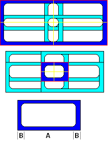
This set of diagrams shows how the mask image is used. In the top two images, the blue sections enclosed in red represent masks of very different sizes, both made of the very same base image, which is shown as the third imagex.
The red line outlines the container used to hold the mask which is of the same size as the overall ProgressBar. The container holds four quadrants, marked by the yellow lines.
The same mask image is set as the background for each of the four individual quadrants but instead of letting it tile normally,
we use the background-position CSS attribute so each is aligned to its own external corner. The blue area shows the corner section of the mask image that
is visible in each quadrant, enclosed in between the ProgressBar edge in red and the edges of the quadrants in yellow,
the light blue areas are the parts of the same image that fall outside of the quadrants and are invisible.
If the top ProgressBar were to be stretched a little more, the now invisible edges opposite each visible corner would start to show. On the other hand, if the lower ProgressBar were to be reduced, the yellow lines would start eating into the rounded inner corners and the inner contour would not blend but meet at an angle.
If we call A the length of the straight section of each edge and B the length of the section from the edge until the rounded inner corner meets the straight section so that the width of the original mask is A + 2 * B, we can use that image as a mask for any ProgressBar that is at least 2 * B on the side (no straight section visible) to 2 * A + 2 * B (the straight sections are seen twice, once in each contiguous cell).
Known Issues
ProgressBar only works correctly if width is specified in pixels (bug 2529310).
A ProgressBar in a ScrollingDataTable is rendered and visible even if the bar is outside the viewable scrolling area (bug 2529072). The following CSS can be applied as a workaround:
.yui-dt-scrollable .yui-dt-bd {
overflow:auto;
position:relative;
}
The ProgressBar is affected by the bug: "JS positioned elements get misplaced on zooming" on Safari 4 and other recent WebKit derivatives.
The "rtl" direction is not supported in IE6.
YUI on Mobile: Using ProgressBar Control with "A-Grade" Mobile Browsers
About this Section: YUI generally works well with mobile browsers that are based on A-Grade browser foundations. For example, Nokia's N-series phones, including the N95, use a browser based on Webkit — the same foundation shared by Apple's Safari browser, which is found on the iPhone. The fundamental challenges in developing for this emerging class of full, A-Grade-derived browsers on handheld devices are:
- Screen size: You have a much smaller canvas;
- Input devices: Mobile devices generally do not have mouse input, and therefore are missing some or all mouse events (like mouseover);
- Processor power: Mobile devices have slower processors that can more easily be saturated by JavaScript and DOM interactions — and processor usage affects things like battery life in ways that don't have analogues in desktop browsers;
- Latency: Most mobile devices have a much higher latency on the network than do terrestrially networked PCs; this can make pages with many script, css or other types of external files load much more slowly.
There are other considerations, many of them device/browser specific (for example, current versions of the iPhone's Safari browser do not support Flash). The goal of these sections on YUI User's Guides is to provide you some preliminary insights about how specific components perform on this emerging class of mobile devices. Although we have not done exhaustive testing, and although these browsers are revving quickly and present a moving target, our goal is to provide some early, provisional advice to help you get started as you contemplate how your YUI-based application will render in the mobile world.
More Information:
- Challenges of Interface Design for Mobile Devices - YUI Blog article by Lucas Pettinati, Yahoo! Sr. Interaction Designer.
- Performance Research, Part 5: iPhone Cacheability - Making it Stick - YUI Blog article by Tenni Theurer and Wayne Shea from the Yahoo! Exceptional Performance Team
ProgressBar is functional in the target mobile browsers.
Support & Community
The YUI Library and related topics are discussed on the on the YUILibrary.com forums.
Also be sure to check out YUIBlog for updates and articles about the YUI Library written by the library's developers.
Filing Bugs & Feature Requests
The YUI Library's public bug tracking and feature request repositories are located on the YUILibrary.com site. Before filing new feature requests or bug reports, please review our reporting guidelines.
ProgressBar Control Examples:
YUI ProgressBar on del.icio.us:
All YUI 2.x users should review the YUI 2.8.2 security bulletin, which discusses a vulnerability present in YUI 2.4.0-2.8.1.
- YUI Library
- YUI Home
- YUI 3
- YUIBlog
- Bug Reports/Feature Requests
- YUI on GitHub
- YUI License
- YUI 2.x Resources
- YUI 2 Archives
- YUI 2 Examples
- YUI 2 API Docs
- YUI 2 Discussion Forums

- YUI Components
- Animation
- AutoComplete
- Browser History Manager
- Button
- Calendar
- Carousel
- Charts
- Color Picker
- Connection Manager
- Container
- Cookie
- DataSource
- DataTable
- Dom
- Drag & Drop
- Element
- Event
- Get
- ImageCropper
- ImageLoader
- JSON
- Layout Manager
- Logger
- Menu
- Paginator
- Profiler
- ProfilerViewer
- ProgressBar
- Resize
- Rich Text Editor
- Selector
- Slider
- Storage
- StyleSheet
- SWF
- SWFStore
- TabView
- TreeView
- Uploader
- Yahoo Global Object
- YUI Loader
- YUI Test
- Reset CSS
- Base CSS
- Fonts CSS
- Grids CSS
Copyright © 2013 Yahoo! Inc. All rights reserved.