YUI 2: Grids CSS
YUI 2: Grids CSS
The foundational YUI Grids CSS offers four preset page widths, six preset templates, and the ability to stack and nest subdivided regions of two, three, or four columns. The 4kb file provides over 1000 page layout combinations. Other features include:
- Supports fluid-width (100%) layouts as well as preset fixed-width layouts at 750px, 950px, and 974px, and the ability to easily customize to any number.
- Supports easy customization of the width for fixed-width layouts.
- Flexible in response to user initiated font-size adjustments.
- Template columns are source-order independent, so you can put your most important content first in the markup layer for improved accessibility and search engine optimization (SEO).
- Self-clearing footer. No matter which column is longer, the footer stays at the bottom.
- Layouts less than 100% are automatically centered.
- Accommodates IAB's Ad Unit Guidelines for common ad dimensions.
- Offers full A-grade browser support.
Quick Links:
- Examples: Explore examples of the Grids CSS in action.
- Release Notes: Detailed change log for the Grids CSS.
- License: The YUI Library is issued under a BSD license.
- Download: Download the Grids CSS as part of the full YUI Library at YUILibrary.com.
Video: The YUI CSS Foundation
In this 42-minute tech talk from October 2007, YUI senior engineer and CSS component author Nate Koechley provides a holistic introduction to this and all of the YUI CSS components. [iPod/iPhone compatible download also available.]
Getting Started
We use and recommend this !DOCTYPE to trigger Standards Mode in browsers with multiple rendering modes:
<!DOCTYPE HTML PUBLIC "-//W3C//DTD HTML 4.01//EN"
"http://www.w3.org/TR/html4/strict.dtd">
To use YUI Grids CSS, include the following source file in your web page with the link element.
<link rel="stylesheet" type="text/css" href="http://yui.yahooapis.com/2.9.0/build/grids/grids-min.css">
Grids rely on the width of an "em" provided by Fonts CSS; therefore, that file must be included. For the sake of this document, the level playing field provided by Reset CSS is also assumed. Including the doctype declaration and links to the files, the top and head of your document should contain the following information:
<!DOCTYPE HTML PUBLIC "-//W3C//DTD HTML 4.01//EN"
"http://www.w3.org/TR/html4/strict.dtd">
<html>
<head>
	<title>YUI Grids CSS </title>
	<!-- Source File -->
	<link rel="stylesheet" type="text/css" href="http://yui.yahooapis.com/2.9.0/build/reset-fonts-grids/reset-fonts-grids.css">
</head>
The YUI CSS Foundation
Note: If you are using the entire YUI CSS foundation, including the Reset, Fonts, and Grids packages, we have provided a concatenated and minified aggregate file for you to use. Including the "reset-fonts-grids.css" file will give you more efficient pageload performance as compared to including each of the foundation files separately.
<!-- Source File -->
<link rel="stylesheet" type="text/css" href="http://yui.yahooapis.com/2.9.0/build/reset-fonts-grids/reset-fonts-grids.css">

YUI Dependency Configurator:
Instead of copying and pasting the filepaths above, try letting the YUI dependency Configurator determine the optimal file list for your desired components; the Configurator uses YUI Loader to write out the full HTML for including the precise files you need for your implementation.
Note: If you wish to include this component via the YUI Loader, its module name is grids. (Click here for the full list of module names for YUI Loader.)
Where these files come from: The files included using the text above will be served from Yahoo! servers. JavaScript files are minified, meaning that comments and white space have been removed to make them more efficient to download. To use the full, commented versions or the -debug versions of YUI JavaScript files, please download the library distribution and host the files on your own server.
Order matters: As is the case generally with JavaScript and CSS, order matters; these files should be included in the order specified above. If you include files in the wrong order, errors may result.
Using YUI Grids CSS
This sections describes how to implement YUI Grids CSS. It contains these sub-sections:
- Starting Base Markup
- Choose the Overall Page Width
- Using Template Presets
- Using Nesting Grids
- Using Special Nesting Grids
- Using ARIA Landmark Roles
- Putting It All Together
Starting Base Markup
In addition to the recommended doctype and YUI's foundational CSS files, we find it useful to construct a page in three stacked regions. We define one region for the header (or masthead), one for the body region, and one for the footer. These regions aren't strictly required, but we will use them in our examples. Including the above, the base markup looks like this:
<!DOCTYPE HTML PUBLIC "-//W3C//DTD HTML 4.01//EN" "http://www.w3.org/TR/html4/strict.dtd">
<html>
<head>
	<title>YUI Grids CSS </title>
	<!-- Source File -->
	<link rel="stylesheet" type="text/css" href="reset-fonts-grids.css">
</head>
<body>
<div id="doc">
   <div id="hd"><!-- header --></div>
   <div id="bd"><!-- body --></div>
   <div id="ft"><!-- footer --></div>
</div>
</body>
</html>
Choose the Overall Page Width
Change the id of the outer div to choose the width of the page. For a 750px width, use #doc. For a 950px width, use #doc2. For a 100% width, also known as fluid width, choose #doc3. Beginning in version 2.3.0, #doc4 provides the increasingly prevelant 974px page width. You can find examples of each on the Grids examples page.
<!-- #doc = 750px width, centered-->
<div id="doc"></div>

<!-- #doc2 = 950px width, centered -->
<div id="doc2"></div>

<!-- #doc3 = 100% width -->
<div id="doc3"></div>

<!-- #doc4 = 974px width, centered -->
<div id="doc4"></div>
Note:
On the advice of our designers, the 100% grid (#doc3) has 10px of margin on the left and right sides. This prevents the content from bleeding into the browser's chrome. If you prefer, you can set it back to zero by adding this to your document:
#doc3 {margin:auto;}
Customizing the Page Width
We've made it easy to customize the page width. Divide your desired pixel width by 13; the result is your width in ems for all non-IE browsers. For IE, divide your desired pixel with by 13.3333 to find the width in ems for IE. Here's an example of a custom page width of 600px, and here's what the CSS looks like:
#custom-doc {
	margin:auto;text-align:left; /* leave unchanged */
	width:46.15em;/* non-IE */
	*width:45.00em;/* IE */
	min-width:600px;/* optional but recommended */
}
Note:
Here are some other things to keep in mind: 1) The width is set in ems because ems scale with user-initiated font-size adjustment, and therefore provide a superior user experience. 2) YUI Fonts does a good job of normalizing the width of an em, but we're still obliged to provide a slightly different value for IE. 3) Be sure the width value for IE comes after the value for everybody else. 4) Setting the min-width is optional, but helps the grid maintain integrity as the viewport shrinks. 5) The text-align and margin are used to help center the page, and should not be modified.
Using Template Presets
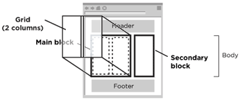
Most web pages have a main block of content and a secondary block of content. The "template" part of Grids allows you to choose the orientation of these blocks (does the narrow one go on the left or the right), as well as the fixed width of the secondary (narrow) block. The main block will take the remaining available space, which varies depending on the overall page width.
The two blocks on the page are both defined as div.yui-b, where "b" stands for block. Wrap the block considered "main" in another div, div#yui-main. It will look like this:
   <div id="bd">
      <div id="yui-main">
         <div class="yui-b"></div>
      </div>
      <div class="yui-b"></div>
   </div>
Note: The above example requires a "doc" and template preset to enable the actual columns. See Available Template Presets for supported template values.
Source-Order Independence
In some cases you may want your secondary content block to appear before your main content block in your markup. For example, some sites put their navigation in the secondary block, yet want it to appear first in the markup for accessibility or search engine optimization (SEO) reasons. YUI Grids offers source-order independence at the yui-b level, without impacting the visual layout of your page. In other words, the "b" wrapped in "main" can come before or after the naked "b" without impacting your visual layout.
Available Template Presets
| Template Class | Preset Description | Example |
|---|---|---|
.yui-t1 |
160 on left | Example |
.yui-t2 |
180 on left | Example |
.yui-t3 |
300 on left | Example |
.yui-t4 |
180 on right | Example |
.yui-t5 |
240 on right | Example |
.yui-t6 |
300 on right | Example |
Here's what the code looks like to choose a template preset:
<div id="doc" class="yui-t4"> <!-- change class to change preset -->
   <div id="hd"></div>
   <div id="bd">
      <div id="yui-main">
         <div class="yui-b"></div>
      </div>
      <div class="yui-b"></div>
   </div>
   <div id="ft"></div>
</div>
We offer the template presets we do because they accommodate standard IAB ad unit dimensions, and because they represent the vast majority of common page structures we use.
Using Nesting Grids
YUI Grids CSS provides a system for subdividing sections of your page with nestable grids. Use this technique to easily create complex layouts that go beyond the two column layouts offered by the template presets. The picture below shows, for example, how a two-column grid is "nested" within the main block:
The Basic Idea
The basic idea is that "grids" are holders of "units". The standard grid holder is a div with a class of "yui-g" (g is for grid). The contained units are divs with a "yui-u" class (u is for unit). Except in special cases we'll examine later, a grid holds two units and instructs each unit to take up half the available space. Here's what a basic nested two-unit grid looks like:
<div id="yui-main">
   <div class="yui-b">
      <div class="yui-g">
         <div class="yui-u first"></div>
         <div class="yui-u"></div>
      </div>
   </div>
</div>
You can see an example of a basic nested two-unit grid in action.
Note: Indicating :first-child
Because not all A-grade browser support the :first-child pseudo-class selector, we manually indicate which node is "first" by adding an additional value to the class attribute. This is useful information to have because, for example, we sometimes float siblings apart.
Deeper Nesting
You can nest grids within other nested grids to create more columns. Here is an example of deeper nesting to create four columns. In the markup below, be sure to note two things. First: If the direct child of a grid is itself a grid, it need not be within a unit; in this case grids behave as units. Second: Be sure to denote the "first" of each set:
<div id="yui-main">
   <div class="yui-b">
      <div class="yui-g">
         <div class="yui-g first">
            <div class="yui-u first"></div>
            <div class="yui-u"></div>
         </div>
         <div class="yui-g">
            <div class="yui-u first"></div>
            <div class="yui-u"></div>
         </div>
      </div>
   </div>
</div>
Using Special Nesting Grids
The standard grid-unit interplay always divides space in two, evenly. To create layouts of more than two units (e.g., three), and to create layouts divided unevenly (e.g., 66% and 33% or 75% and 25%), we employ special grid holders. While "yui-g" tells the two children each take up half the space each, "yui-gc" tells the first unit to take up two-thirds of the space, and the other unit to take up one-third of the space. Everything else remains the same: units live within grids, and the first of a set must be indicated. Here is an example of a special grid for a two-thirds / one-third layout, and here's what the markup looks like:
<div id="yui-main">
   <div class="yui-b">
      <div class="yui-gc"> <!-- the "special grid" -->
         <div class="yui-u first"></div>
         <div class="yui-u"></div>
      </div>
   </div>
</div>
Available Special Nesting Grids
| Special Grid Class | Description | Example |
|---|---|---|
.yui-gb |
1/3 - 1/3 - 1/3 | Example |
.yui-gc |
2/3 - 1/3 | Example |
.yui-gd |
1/3 - 2/3 | Example |
.yui-ge |
3/4 - 1/4 | Example |
.yui-gf |
1/4 - 3/4 | Example |
Using ARIA Landmark Roles
While <div>s provide a means of organizing
content (e.g. distinguishing navigation, the main content, the footer, etc.),
users of screen readers are unable to immediately perceive the role of
each section of a Grid. The
ARIA Landmark Roles
improve the accessibility of layouts created using Grids by allowing developers
to more accurately declare the intended purpose
of each section of a document or application.
ARIA Landmark Roles are applied using the role
attribute, and can be used to improve the semantics of any section of a Grid.
For example, using the role of navigation
enables users of screen readers to skip directly to the section of the
Grid that contains the site's navigation.
Presently there are seven different ARIA Landmark Roles:
Below is a simple example of how to apply the ARIA Landmark Roles to the
sections of a Grid. (Note: Some ARIA Landmark Roles such as
banner and main are only to be used once inside a
section with a role of document or application applied.) For more info on using the
ARIA Landmark Roles consult both the
ARIA Specification
and corresponding
Best Practices document.
<!DOCTYPE HTML PUBLIC "-//W3C//DTD HTML 4.01//EN" "http://www.w3.org/TR/html4/strict.dtd">
<html>
<head>
	<title>YUI Grids CSS </title>
	<!-- Source File -->
	<link rel="stylesheet" type="text/css" href="reset-fonts-grids.css">
</head>
<body>
	<div id="doc" class="yui-t4">
	   <div id="hd" role="banner"><!-- Header --></div>
	   <div id="bd">
	      <div id="yui-main">
	         <div class="yui-b" role="main"><!-- Main content --></div>
	      </div>
	      <div class="yui-b" role="complementary"><!-- Secondary content --></div>
	   </div>
	   <div id="ft" role="contentinfo"><!-- Footer --></div>
	</div>
</body>
</html>
Note: The YUI Grids Builder incorporates the ARIA Landmark Roles to make for easy building of accessible Grids.
In addition to improving the semantics of a Grid, use of the ARIA Landmark Roles significantly improve its navigability. For example, the JAWS screen reader will announce all of the ARIA Landmarks when a page is loaded, and allows users to quickly jump between them by pressing the semicolon key. The following video illustrates a user of the JAWS screen reader navigating amongst various ARIA Landmarks in a document created using Grids.
Putting It All Together
Combining Page Widths, Template Presets, and Nesting Grids, a nearly infinite number of complex page layouts are possible. No matter how you put the pieces together, you just need the unmodified YUI Grids CSS file - it's all in the single file! Give it a shot, check out all the examples, and enjoy.
YUI on Mobile: Using Grids CSS with "A-Grade" Mobile Browsers
About this Section: YUI generally works well with mobile browsers that are based on A-Grade browser foundations. For example, Nokia's N-series phones, including the N95, use a browser based on Webkit — the same foundation shared by Apple's Safari browser, which is found on the iPhone. The fundamental challenges in developing for this emerging class of full, A-Grade-derived browsers on handheld devices are:
- Screen size: You have a much smaller canvas;
- Input devices: Mobile devices generally do not have mouse input, and therefore are missing some or all mouse events (like mouseover);
- Processor power: Mobile devices have slower processors that can more easily be saturated by JavaScript and DOM interactions — and processor usage affects things like battery life in ways that don't have analogues in desktop browsers;
- Latency: Most mobile devices have a much higher latency on the network than do terrestrially networked PCs; this can make pages with many script, css or other types of external files load much more slowly.
There are other considerations, many of them device/browser specific (for example, current versions of the iPhone's Safari browser do not support Flash). The goal of these sections on YUI User's Guides is to provide you some preliminary insights about how specific components perform on this emerging class of mobile devices. Although we have not done exhaustive testing, and although these browsers are revving quickly and present a moving target, our goal is to provide some early, provisional advice to help you get started as you contemplate how your YUI-based application will render in the mobile world.
More Information:
- Challenges of Interface Design for Mobile Devices - YUI Blog article by Lucas Pettinati, Yahoo! Sr. Interaction Designer.
- Performance Research, Part 5: iPhone Cacheability - Making it Stick - YUI Blog article by Tenni Theurer and Wayne Shea from the Yahoo! Exceptional Performance Team
YUI Grids CSS works well with the high-end mobile devices on which we've tested it. Specifically, the versions of Webkit found on Nokia N-Series phones and Apple's iPhone both render Grids layouts well. Both browsers' birds-eye view modes give you a high-level picture of the page. On the iPhone, you can quickly navigate to a specific subsection of a Grid by double-clicking it; the iPhone's renderer correctly zooms in on Grid units as you would expect. Any of the Grids examples found here can be used as a starting point for evaluating the user experience with these devices.
From a design perspective, Grids CSS is probably a good choice for applications that are meant to be consumed by both PC browsers and mobile A-Grade browsers; because the Grids model tends to assume a larger screen size, it's not recommended as a starting point for applications that are mobile-specific.
Support & Community
The YUI Library and related topics are discussed on the on the YUILibrary.com forums.
Also be sure to check out YUIBlog for updates and articles about the YUI Library written by the library's developers.
Filing Bugs & Feature Requests
The YUI Library's public bug tracking and feature request repositories are located on the YUILibrary.com site. Before filing new feature requests or bug reports, please review our reporting guidelines.
CSS Grids Examples:
Page Widths
Choose the overall page width.
- #doc - 750px centered (good for 800x600)
- #doc2 - 950px centered (good for 1024x768)
- #doc3 - 100% fluid (good for everybody)
- #doc4 - 974px fluid (good for 1024x768)
- #doc-custom - an example of a custom page width
Templates
Optionally choose the secondary column's width and orientation with one of six templates.
- .yui-t1 - Two columns, narrow on left, 160px
- .yui-t2 - Two columns, narrow on left, 180px
- .yui-t3 - Two columns, narrow on left, 300px
- .yui-t4 - Two columns, narrow on right, 180px
- .yui-t5 - Two columns, narrow on right, 240px
- .yui-t6 - Two columns, narrow on right, 300px
Nesting Grids
Optionally nest standard grids (.yui-g) and special grids (.yui-gb, ... .yui-gf) to subdivide.
More Reading about the YUI CSS Grids:
- Intricate Fluid Layouts in Three Easy Steps, by Grids author Nate Koechley
- How to play with Yahoo Grids CSS, by Black Mountain
- YUI Grids Wizard, by accomplished YUI hacker Matt Warden (similar to the YUI Grids Builder)
YUI Grids on del.icio.us:
All YUI 2.x users should review the YUI 2.8.2 security bulletin, which discusses a vulnerability present in YUI 2.4.0-2.8.1.
- YUI Library
- YUI Home
- YUI 3
- YUIBlog
- Bug Reports/Feature Requests
- YUI on GitHub
- YUI License
- YUI 2.x Resources
- YUI 2 Archives
- YUI 2 Examples
- YUI 2 API Docs
- YUI 2 Discussion Forums

- YUI Components
- Animation
- AutoComplete
- Browser History Manager
- Button
- Calendar
- Carousel
- Charts
- Color Picker
- Connection Manager
- Container
- Cookie
- DataSource
- DataTable
- Dom
- Drag & Drop
- Element
- Event
- Get
- ImageCropper
- ImageLoader
- JSON
- Layout Manager
- Logger
- Menu
- Paginator
- Profiler
- ProfilerViewer
- ProgressBar
- Resize
- Rich Text Editor
- Selector
- Slider
- Storage
- StyleSheet
- SWF
- SWFStore
- TabView
- TreeView
- Uploader
- Yahoo Global Object
- YUI Loader
- YUI Test
- Reset CSS
- Base CSS
- Fonts CSS
- Grids CSS
Copyright © 2013 Yahoo! Inc. All rights reserved.